
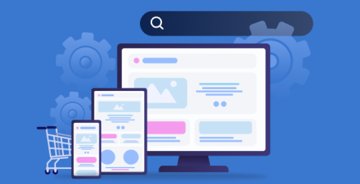
Nowadays, when more and more users browse the Internet on different devices, website responsiveness has become a key element of its success. For online store owners, this means adapting their sites to different screen sizes and ensuring that customers have a positive experience no matter what device they use. In this article, we present the most important tips and tricks for building a responsive online store.
1. Choose the right e-commerce platform
The basis of a responsive online store is choosing an e-commerce platform that offers built-in responsive features. Popular platforms like Shopify, WooCommerce, and Magento have templates and themes designed with responsiveness in mind. Make sure the platform you choose is flexible and easy to adapt.
2. Use flexible grids (grid systems)
Flexible grids are the foundation of responsive design. Using CSS Grid or Flexbox allows you to create layouts that automatically adjust to the screen size. This ensures that page elements such as images, text, and buttons will move and scale appropriately across devices.
3. Optimize images
Images are a key element of any online store, but they can significantly slow down page loading if they are not properly optimized. Use formats such as WebP, which offer better compression without sacrificing quality. Additionally, use the lazy loading technique to load images only as the user scrolls towards them.
4. Test on different devices
Regularly testing the website on different devices (smartphones, tablets, laptops) and in different browsers is essential. Make sure the site runs smoothly and looks good on all of them. Tools like Google Mobile-Friendly Test can help identify issues and suggestions for improving responsiveness.
5. Make navigation easier
Navigating on small screens can be a challenge, so it's worth using some proven solutions:
- Hamburger menu: A collapsed menu that expands on click saves space and is intuitive for users.
- Customized buttons: Make sure the buttons are large enough to be easily pressed with a finger and placed in easy-to-access places.
- Simple Forms: Purchase and registration forms should be kept as simple as possible to minimize scrolling and increase conversions.
6. Use media queries
Media queries are a basic CSS tool for creating responsive websites. They allow you to use different styles depending on the screen size. For example, you can set larger fonts and different spacing on smaller screens to make text easier to read.
7. Take care of the page loading speed
Page loading speed has a direct impact on user experience and search engine positioning. In addition to image optimization, use techniques such as CSS and JavaScript file compression, browser cache, and external content delivery networks (CDNs).
8. Integrate mobile payments
Making the checkout process easier on mobile devices is key to increasing conversions. Integrating mobile payment options such as Apple Pay, Google Pay or other fast payment methods can significantly improve the shopping experience for mobile users.
9. Pay attention to UX (User Experience)
Responsive design is not only about technically adapting the website to different screens, but also ensuring a positive user experience. Focus on simplicity of navigation, readability of content and ease of purchase. Regularly collect feedback from users and make appropriate changes.
10. Monitor and analyze
After implementing responsive design, don't forget to regularly monitor the results. Use analytics tools like Google Analytics to track user behavior across devices. Analyze data and make improvements to continually improve user experiences.
Summary
Building a responsive online store is a process that requires taking into account many factors. Choosing the right platform, using flexible grids, optimizing images, testing on different devices, making navigation easier, using media queries, taking care of page loading speed, integrating mobile payments, paying attention to UX and regular monitoring and analysis are the key elements that will help you create a store internet adapted to the needs of modern users. With these tips, you can ensure your customers have a positive shopping experience no matter what device they use.